Citi ThankYou Rewards
Citi wanted to elevate consumer’s perception of their global rewards program with an ADA compliant responsive website that highlights redemption options for travel, gift cards, merchandise and more.
I was brought on as the lead art director on a pitch to win Citi’s business for this site. We wowed the client with two different concepts and ultimately won the business. Citi was so pleased with the work that they also rewarded us with their marketing / CRM business.


Homepage
The homepage consists of interchangeable responsive modules that promote different redemption options. Travel appears first on the site to create an aspirational feeling. Most users redeem points for gift cards, so they naturally appear next. Merchandise is represented by category images to avoid the awkwardness of third party imagery. Finally, it was necessary to let users know that there is even more they can do with their points (represented by iconography).
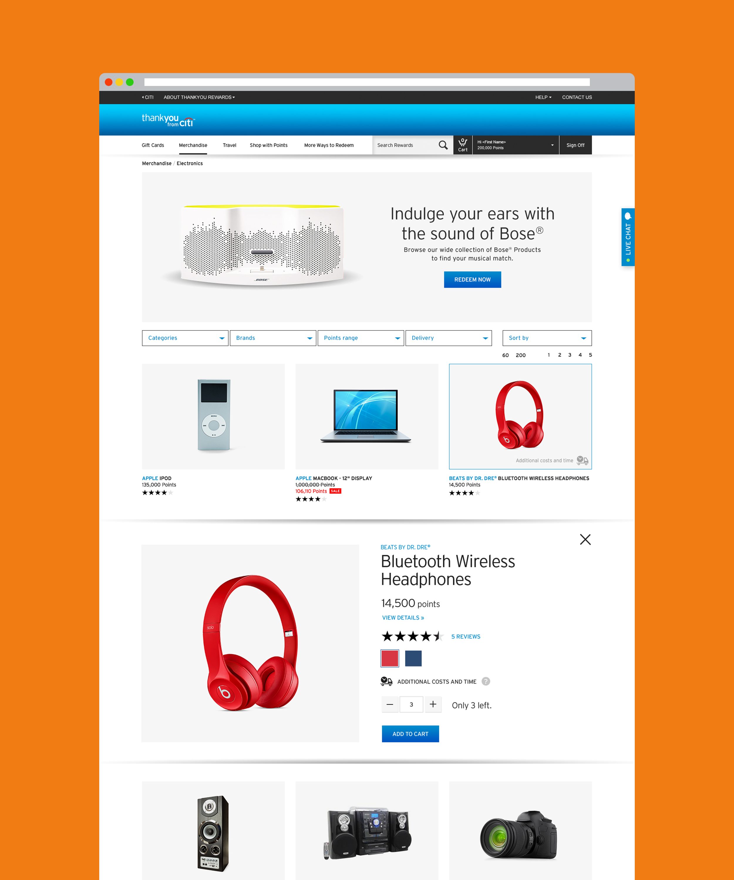
Redeeming points for merchandise
Landing pages for Merchandise feature options for promotional banners on top for third party partnership opportunitities. Product listings were updated to feature ratings, quick views and sorting filters previously unavailable.

Iconography
We created an icon family to represent the many redemption options for users on the ThankYou Rewards website.
Image Library for Asian Pacific Markets
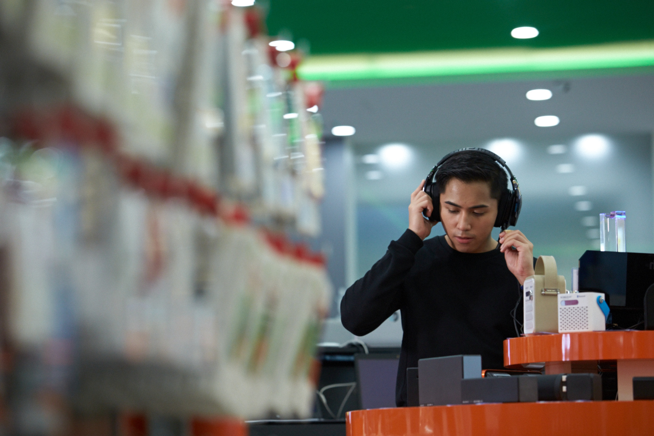
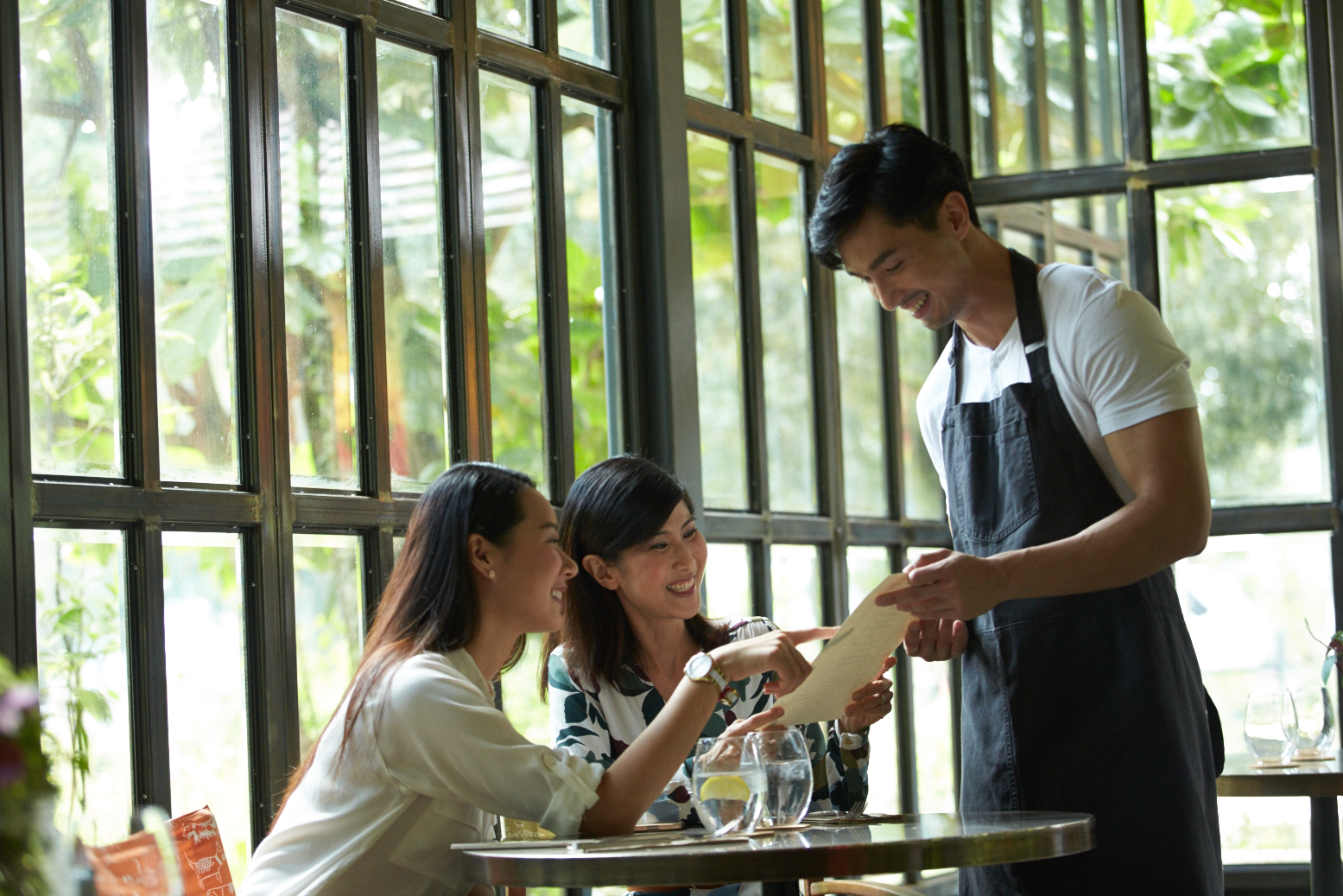
As we versioned out the ThankYou Rewards website for Asian Pacific markets, we struggled to source authentic-looking imagery from stock photography sites. It became clear that we needed to create our own image library via a photoshoot. We decided that Singapore would be the perfect location to draw talent that represented the many Asian markets where Citi is present (Taiwan, Hong Kong, Malaysia, Thailand, Singapore). Photographer Nicky Loh helped us depict travel, dining and shopping scenarios that aligned with the ThankYou Rewards program in Asian cultures.
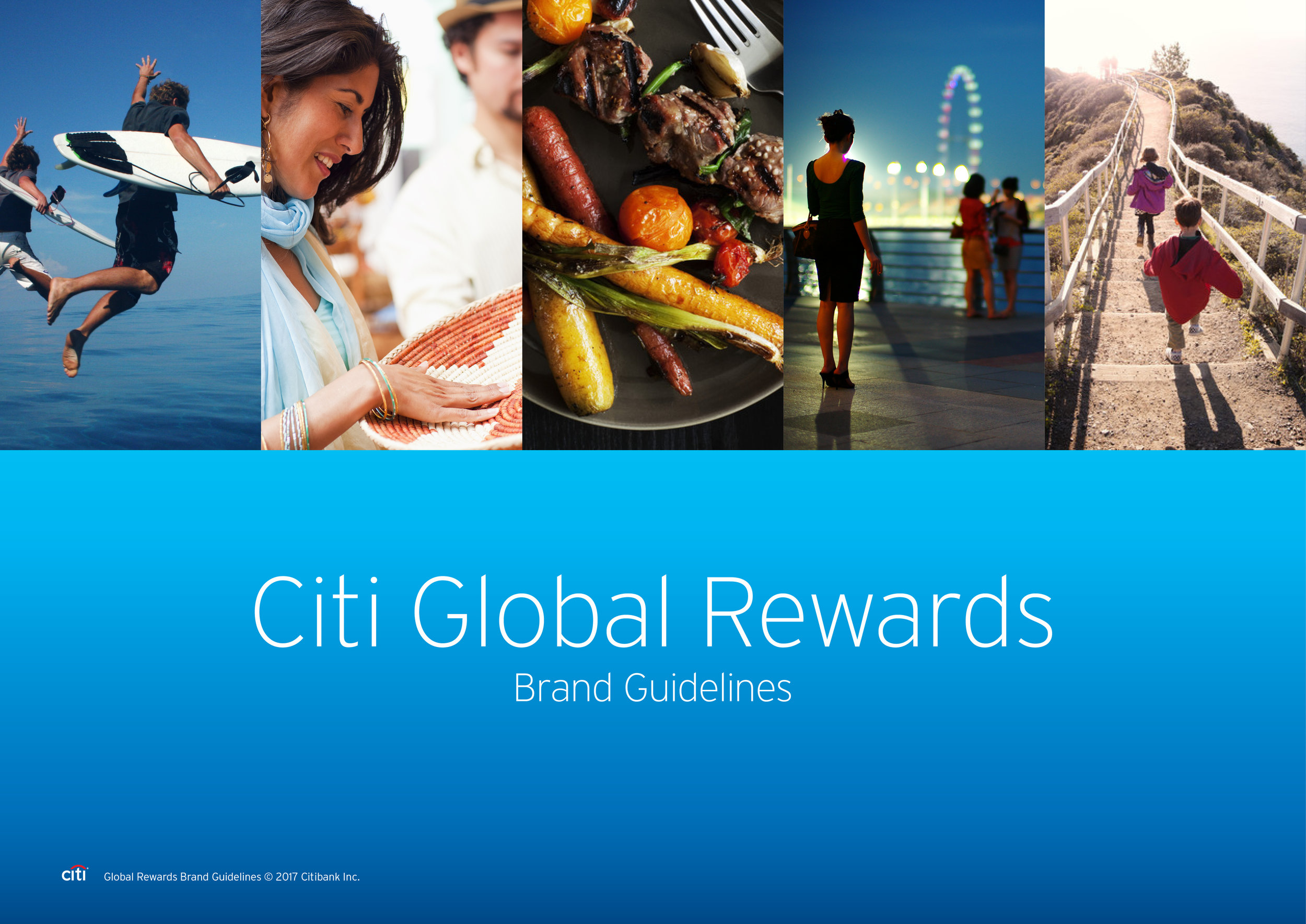
Style Guide
We were tasked with creating guidelines to help markets outside of the US maintain the new website. We addressed the brand mission, the brand voice and terminology, imagery, iconography, design and layout.

Alternate Site Concept
The client approved two different concepts that I created to develop into prototypes. This one was meant to immerse the user in the redemption process earlier than the other concept on this page, starting the process on the homepage rather than requiring users to click to secondary pages. Visuals were also a bit different. In this version, the hero image featured illustrations of aspirational redemption options instead of lifestyle stock imagery.

